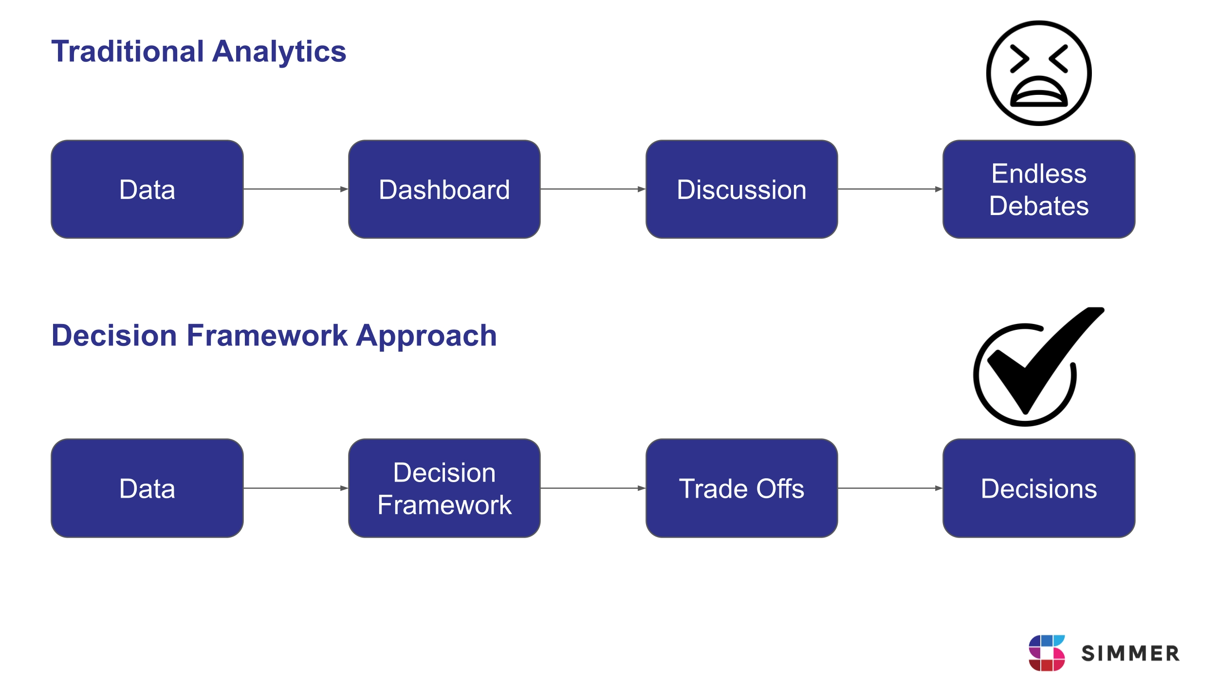
Over the last decade, the analytics industry has become exceptionally good at measurement. We can track nearly every click, scroll, session, and conversion. Dashboards update in real time. In other words, the data-driven part of “data-driven decision-making” is largely under control.
The decision-making part is not.
Despite having more data than ever, many organizations still struggle to make clear, deliberate choices about where to invest time, budget, and effort. The problem is not a lack of data. It is a lack of structure around tradeoffs.
As a result, budgets are spread thinly across too many initiatives, optimization efforts focus on marginal gains, and teams move without a clear sense of priority.
The Root Cause: Reporting Performance Instead of Framing Choices
Most analyses answer the question: “How did this perform?”. Very few answer: “Given these alternatives, where should we invest?”. Performance reporting looks backward. Decision-making looks forward and forces comparison. Without explicit alternatives and shared evaluation criteria, discussions default to:
- The loudest stakeholder
- The most recent campaign
- The metric that looks impressive
- Organizational politics
Data does not resolve ambiguity unless it is organized around a choice.
What is a Decision Framework?
A decision framework is a way to structure choices so they can be discussed and evaluated deliberately. It makes choices explicit by clearly defining the alternatives. And it makes them comparable by evaluating those alternatives along a shared set of dimensions, so tradeoffs become clear.
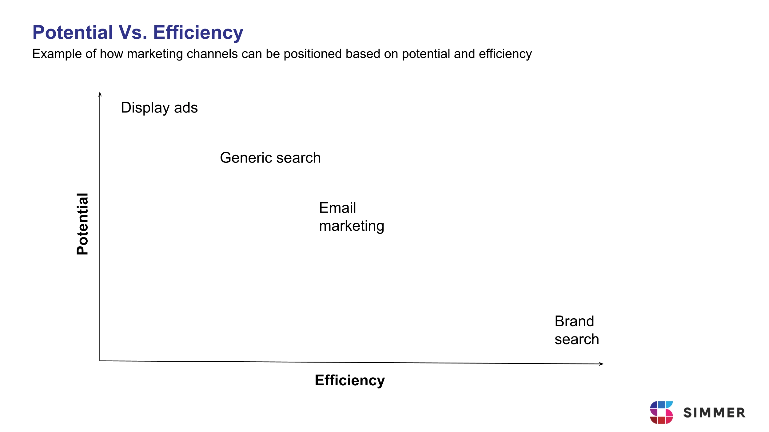
Most business decisions can be seen as a tradeoff between two dimensions: potential and efficiency.
Potential is about how big the opportunity is. In digital marketing, potential can be approximated by things like audience size or monthly search volume.
Efficiency is about execution quality. It describes how effectively that potential is turned into results. In digital marketing, this can be measured using metrics such as conversion rate, cost per lead, or profit on ad spend.
A Practical Example from the Financial Industry
In a past project with a company in the financial industry, the sales team raised a familiar concern: they were not getting enough leads.
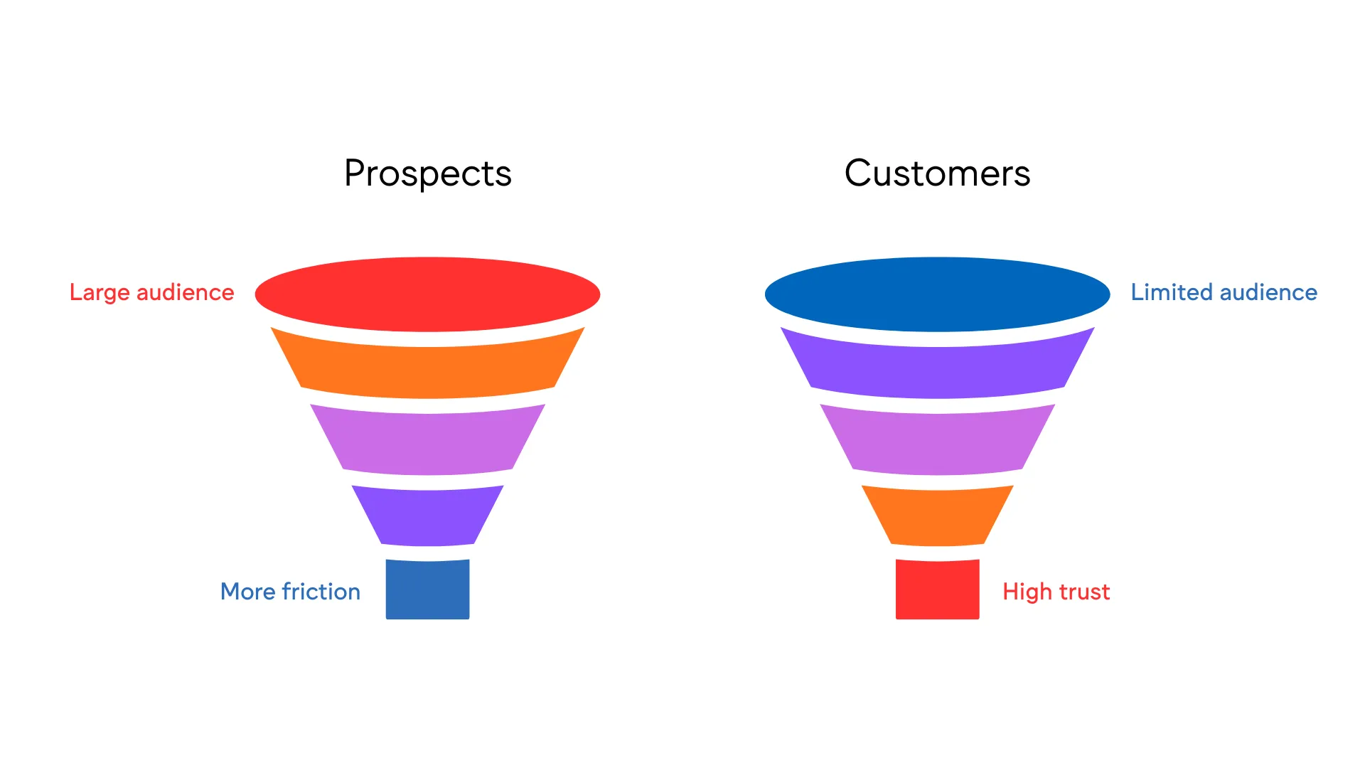
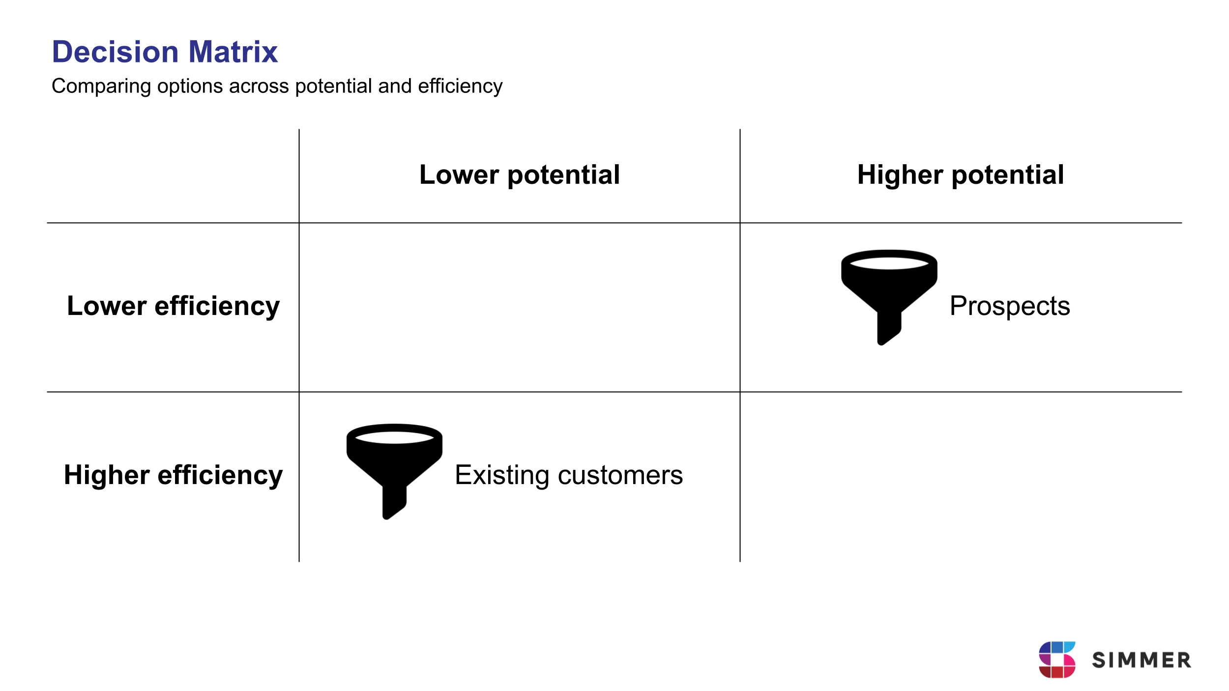
In this case, leads came from two main funnels. One funnel targeted prospects, people who were not yet customers. The other targeted existing customers, who could be interested in additional products. These two funnels behaved very differently, but were often discussed together under the same label: leads.
When we analyzed the data, both funnels showed strengths, but on different dimensions. The existing customer funnel converted very well. Trust was already established, and sales conversations were easier. However, the total volume of leads was limited by the size of the existing customer base.
The prospect funnel showed the opposite pattern. Conversion rates were lower and journeys were more complex, but the potential volume was much larger. There were simply many more people who could enter this funnel.
At that point, the question was no longer which funnel performed better. Each dominated a different dimension. The real question was where to invest optimization effort.
Using a simple decision framework helped make the tradeoff clear. The prospect funnel had higher potential but lower efficiency, whereas the existing customer funnel had higher efficiency but limited potential, as displayed in the image below:
Context Matters
Data alone is not enough to make good decisions. It is important to talk to stakeholders, because they often have strategic, operational, or organizational context that is not visible in the data.
In this case, a conversation with the head of sales revealed an important constraint: the company had recently hired many new salespeople. As a result, the immediate priority was not lead quality, but lead volume. Given that context, focusing on the prospect funnel was the option most aligned with what the company was trying to achieve. This is why stakeholder input is a key part of decision-making.
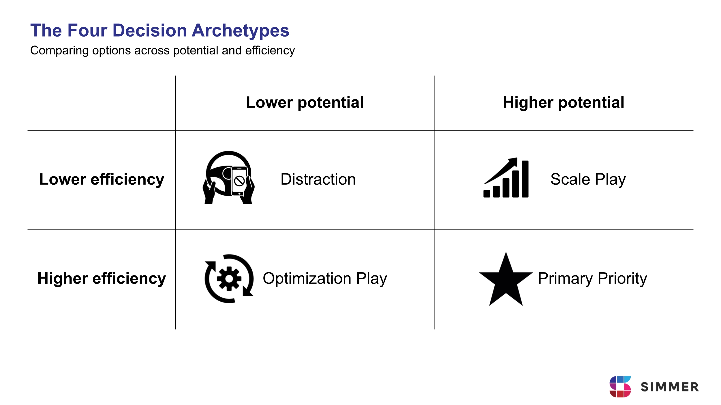
The Four Decision Archetypes
Once the data is mapped, the alternatives usually fall into one of four archetypes.
The Primary Priority (High Efficiency / High Potential): These are your stars. They convert well and have room to grow. They should receive investment first, but in a mature business, they are rare.
The Scale Play (Low Efficiency / High Potential): These are high-risk, high-reward opportunities (like the Prospect Funnel in our example). They require significant optimization or a higher tolerance for cost-per-lead to unlock their massive volume.
The Optimization Play (High Efficiency / Low Potential): These are safe bets (like the Existing Customer funnel). They are reliable and profitable but won’t move the needle on their own because the ceiling is too low.
The Distraction (Low Efficiency / Low Potential): These are projects that consume resources without the ability to scale or convert. A decision framework’s greatest value is often the objective justification to kill these initiatives.
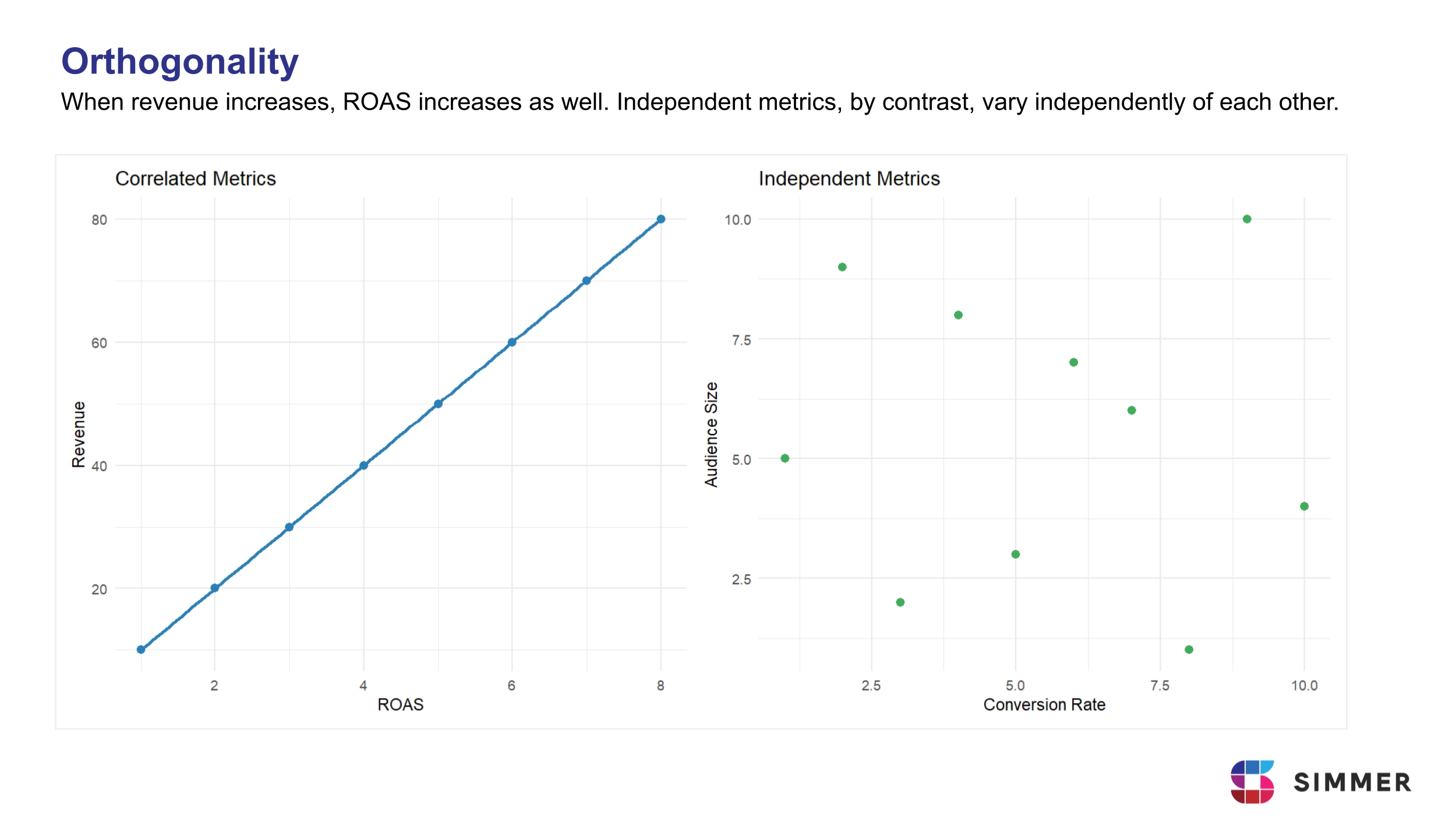
Caveat 1: The Importance of Orthogonality
When selecting dimensions for your framework, it is vital that they are orthogonal. This means they should be independent of one another. If your two dimensions are mathematically or logically linked, you are not measuring two different things. You are simply double-counting the same success factor.
Take campaigns evaluated by Revenue and Return on Ad Spend (ROAS). ROAS is calculated using revenue and ad spend. If revenue increases while spend stays the same, ROAS will also increase. When you plot Revenue on one axis and ROAS on the other, it may look like you are comparing two separate strengths. In reality, both axes are largely driven by revenue.
The result is misleading. Campaigns with higher revenue will often appear in the “high-high” quadrant, not because they dominate two independent dimensions, but because one metric reinforces the other. Instead of highlighting real tradeoffs, the matrix simply repeats the same signal.
True insight comes from pairing dimensions that capture different realities, such as opportunity size and conversion efficiency. When both axes are independent, strong performance on both reflects genuine strength rather than duplicated measurement.
Before trusting any decision framework, ask a simple question: if one metric changes, does the other move automatically? If it does, your dimensions are not independent and the framework needs to be redesigned.
Caveat 2: Strategic Relevance
It is easy to build a beautiful matrix using metrics that are technically accurate but strategically irrelevant.
For example, an analyst might map marketing channels based on Engagement Rate (Efficiency) and Follower Growth (Potential). While these are easy to measure, they are “Vanity Metrics” if the company’s actual goal is Customer Acquisition Cost (CAC) optimization.
A channel could have high engagement because people enjoy the content, but if those users never convert into paying customers, the “Efficiency” of that channel is an illusion. In this case, your framework would favor a channel that is “winning” at a game the business isn’t actually playing.
When selecting your dimensions, you must ask: If a project displays high efficiency and high potential based on your chosen proxies, does it actually move the needle on the company’s primary KPI?
The Operational Requirement: Custom Proxies and Reproducibility
Frameworks require explicit definitions of Potential and Efficiency. In practice, this means building custom proxies that reflect how the business actually creates value. Default tool metrics rarely align perfectly with strategic objectives.
Defining these proxies is not a technical detail. It is the core responsibility of the analyst. We decide how the business logic is encoded, which dimensions are independent, and whether the framework reflects strategic reality.
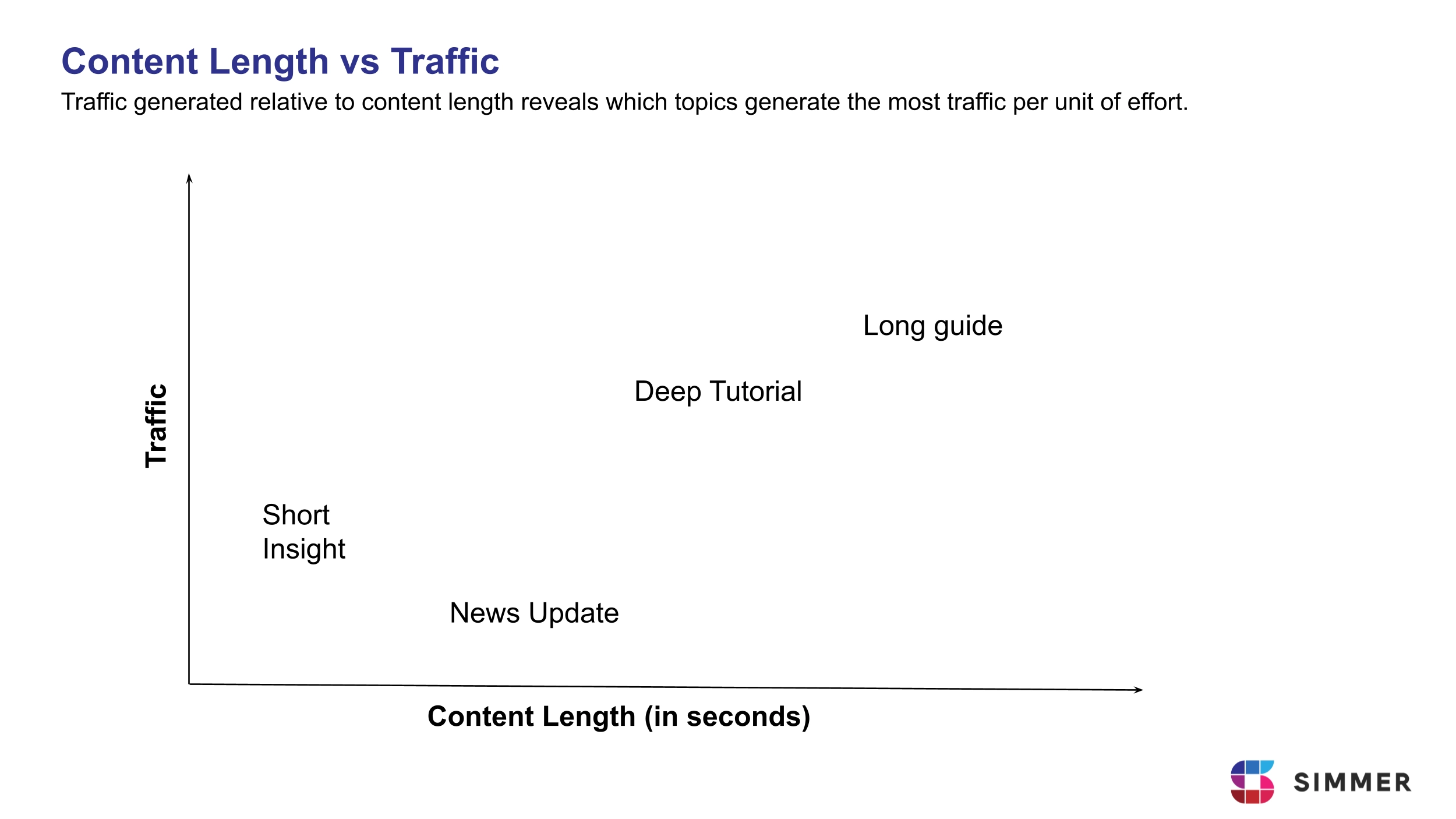
In our Data Analysis With R course, for example, we don’t just look at “Pageviews.” We construct a custom Efficiency proxy: Traffic generated per second of content.
Think of it this way: A 2,000-word deep dive and a 200-word news snippet are different inputs. By calculating how much traffic a topic generates relative to the length (the time/effort) of the content published, we find the true ROI of a topic. This is an Efficiency proxy that standard tools like GA4 cannot calculate out of the box because it requires joining your analytics data with your content metadata (like word count or video duration).
Why R Enables This Discipline
Spreadsheets are flexible but become brittle as logic grows more complex. Formulas are copied, modified, and eventually become difficult to audit. Small changes can quietly alter results. Many BI tools constrain metric definitions to what the interface allows, making custom logic harder to implement or automate.
In R, analysts define their metrics programmatically. Business rules are written explicitly in code, version-controlled, and re-run whenever new data arrives. This allows decision frameworks to become operational systems rather than temporary analyses.
If you want to learn how to design meaningful proxies, structure decision frameworks, and turn analysis into clear recommendations, explore our course Data Analysis With R. No prior programming experience is required.
The Decision Framework Checklist
- Define the Alternatives: Explicitly state the options you are evaluating.
- Establish Your Proxies: Determine exactly how you will measure Potential (opportunity size) and Efficiency (execution quality).
- Use Independent Dimensions: Make sure your measures of Potential and Efficiency are not mathematically or logically linked. If a change in one metric automatically moves the other, you are double-counting the same signal.
- Align With the Primary KPI: Make sure that doing well on both axes would actually move the company’s main goal forward. If it wouldn’t, you are measuring success in a way that doesn’t really matter.
- Integrate Strategic Context: Consult stakeholders to identify the organizational constraints or incentives that shift priorities such as a sudden need for volume over margin.
- Make the Logic Reproducible: Ensure that your proxies, calculations, and assumptions are explicitly defined and can be re-run when new data arrives. If the analysis cannot be audited or replicated, it cannot become part of a consistent decision process.
- Visualize the Trade-offs: Map your findings onto a Decision Matrix to transform abstract data into a clear, comparable choice for leadership.
If any of these elements are missing, you are not presenting a decision. You are presenting data.